
Logos & Logotypes
If forced to pick one job for the rest of my life, it might be “logo designer.” I consider logos to be the truest (and simplest) expression of the graphic designer’s craft. To sum up in a single mark everything that a company, product or organisation represents, or hopes to, is no small task. But finding that one mark that really works is incredibly rewarding.
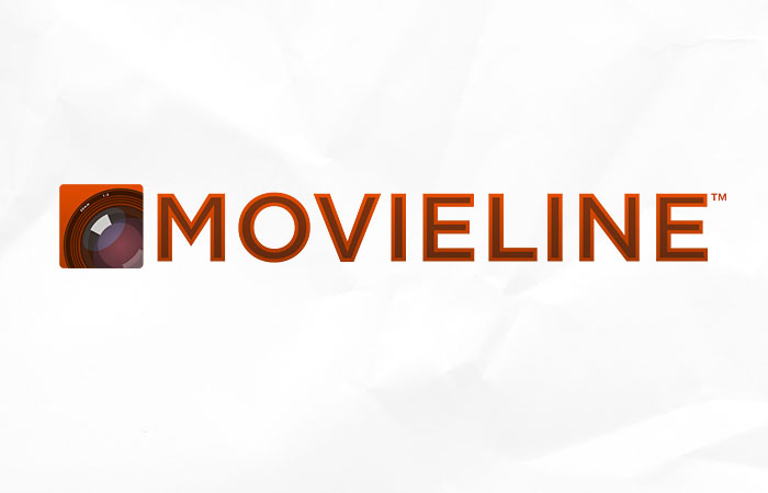
Looking for an updated image, Movieline approached me to develop something new, but something classic.
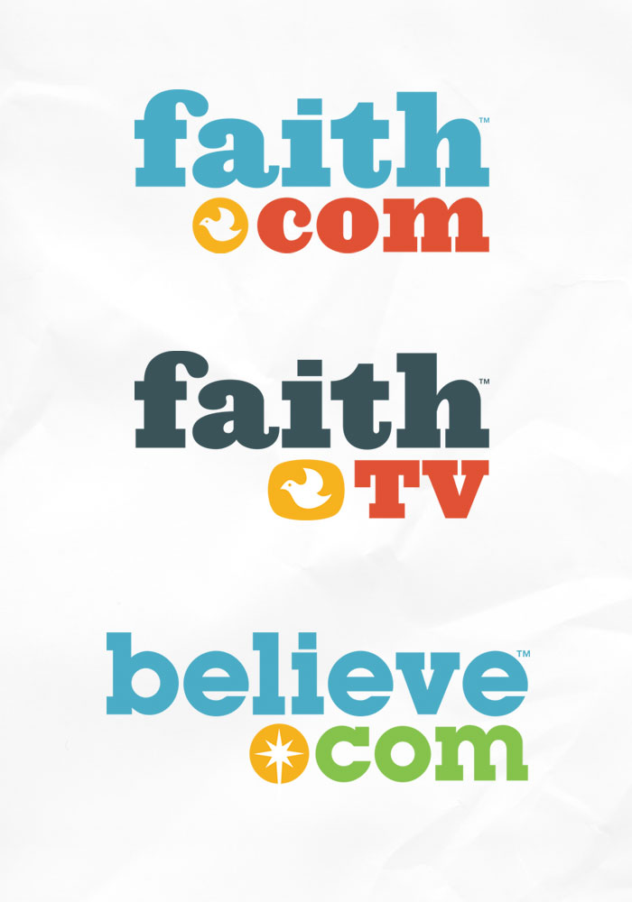
I developed this logo system for a handful of faith-based magazine sites for Gospel Media Group and Spark Networks. The goal was to create something light and upbeat that communicated its faith-based roots, but with a light touch meant to appeal to a wider audience.
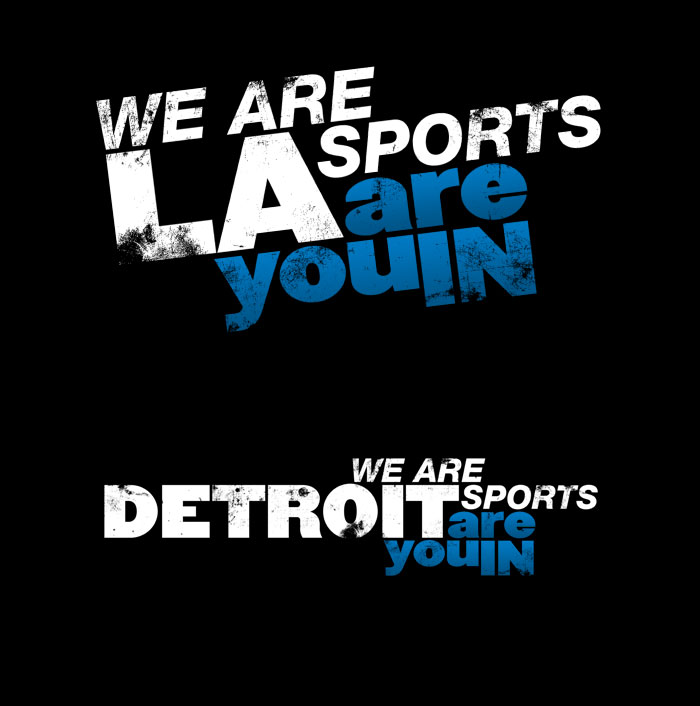
I produced this logotype for FOX Sports West. Working with their team, we specifically developed this as a template that could be used in any of the cities in which FOX Sports operates.

I once had a thought that the only thing holding biodiesel (as a promising green technology) back was poor branding. If we could just sex it up, maybe this fuel alternative wouldn’t have to fight such an uphill battle. My early attempts to push this “open source branding†met with little success, but I’m still interested in the idea of communal branding of social causes.
I’ve looked at a lot of the other biodiesel logos out there, and I’m fairly certain they all suck. When I created this logo, I was adamant that it should be something that would look as good on the back window of a VW TDI as it would on the side of a biodiesel pump. I think this works.

In the height of the dot-com era, I created this mark for a young video game start-up. It’s painfully simple, but that simplicity helps it to last… longer than the venture for which it was designed. : [


This bank logo was one of two created as props or set dressing for a Microsoft promotional video. This type of production graphic design is an experience I would repeat if given the opportunity.

The other production graphic design logo created for a Microsoft promotional video.


This design still makes me giggle, because now I cannot help but see the face in it.

A logo for a software product.

These were part of an extended mark system for the Raspberry product.

Working within Microsoft’s strict brand guidelines still allowed for some interesting and energetic designs.

This “undesigned” look was for an arts collective with a strong emphasis on print-making.


My earlier version of this logo was created using the company’s corporate typeface at the time, Franklin Gothic. This update using Segoe is still attractive.

A simple, friendly mark for a real estate agency.

This couple’s logo/chop is very monogram-like, which should look attractive stitched into… towels?

The logo for a Microsoft-sponsored technology conference.

The journey to finding a mark can produce many interesting options.